When visiting any eCommerce site certain pages are expected, such as the product page, the home page, or the shopping cart. Having these pages inspire trust and give enough familiarity to the average user so that they remain at the site, explore it, and eventually make a purchase.
Some pages are necessary for the eCommerce site’s function, while others serve to support different aspects of client care and interaction, such as aftercare or dealing with complaints.
At R Digital we have vast experience in creating popular and efficient eCommerce sites. It’s this know-how we’re sharing today by presenting the essential pages each eCommerce site must have in order to be functional, user-friendly, trustworthy, and safe for the retailer as well as the consumer.
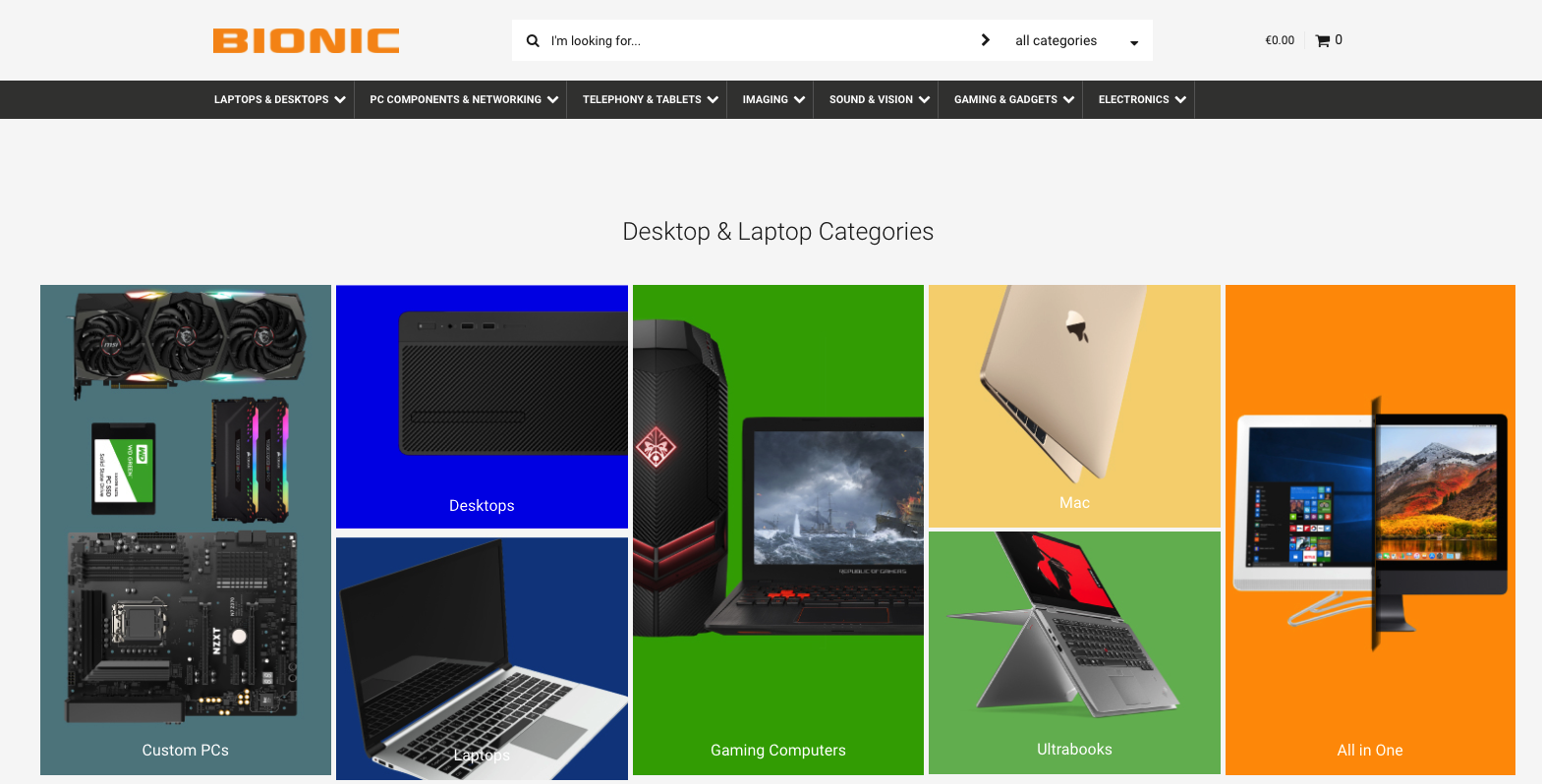
1. The home page
This one is perhaps the most important page of the entire site: it’s the first page a user will see, and in a few vital seconds, it must have achieved in communicating the following:
- The brand
- The brand’s general identity and character
- The brand’s main sector of operation or nature of business
- Why the brand products are unique and good value for money
- The site navigation
- Any promotions or other opportunities for consumers
- Featured products or new arrivals
- Conditions for free shipping, if any
- Community messages or the brand’s blog
The home page is considered the front door and window of a business, so it’s the one that gets designed first and sets the framework for the style of all other pages.
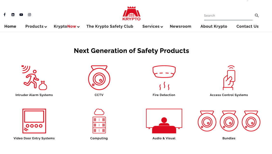
2. Category Overview
This page or group of pages are there to summarize the types of products included in a specific category, rather than list all the products one by one. Think of the category overview page as a compass that will guide the user to find the correct category pages, and thus locate the items they are looking for more easily.
This type of page is suitable for eCommerce sites where several different categories of several different products are available and would help a user navigate the site. If your site doesn’t have as many products or doesn’t need a multi-level categorization, you may not need to have this type of page.
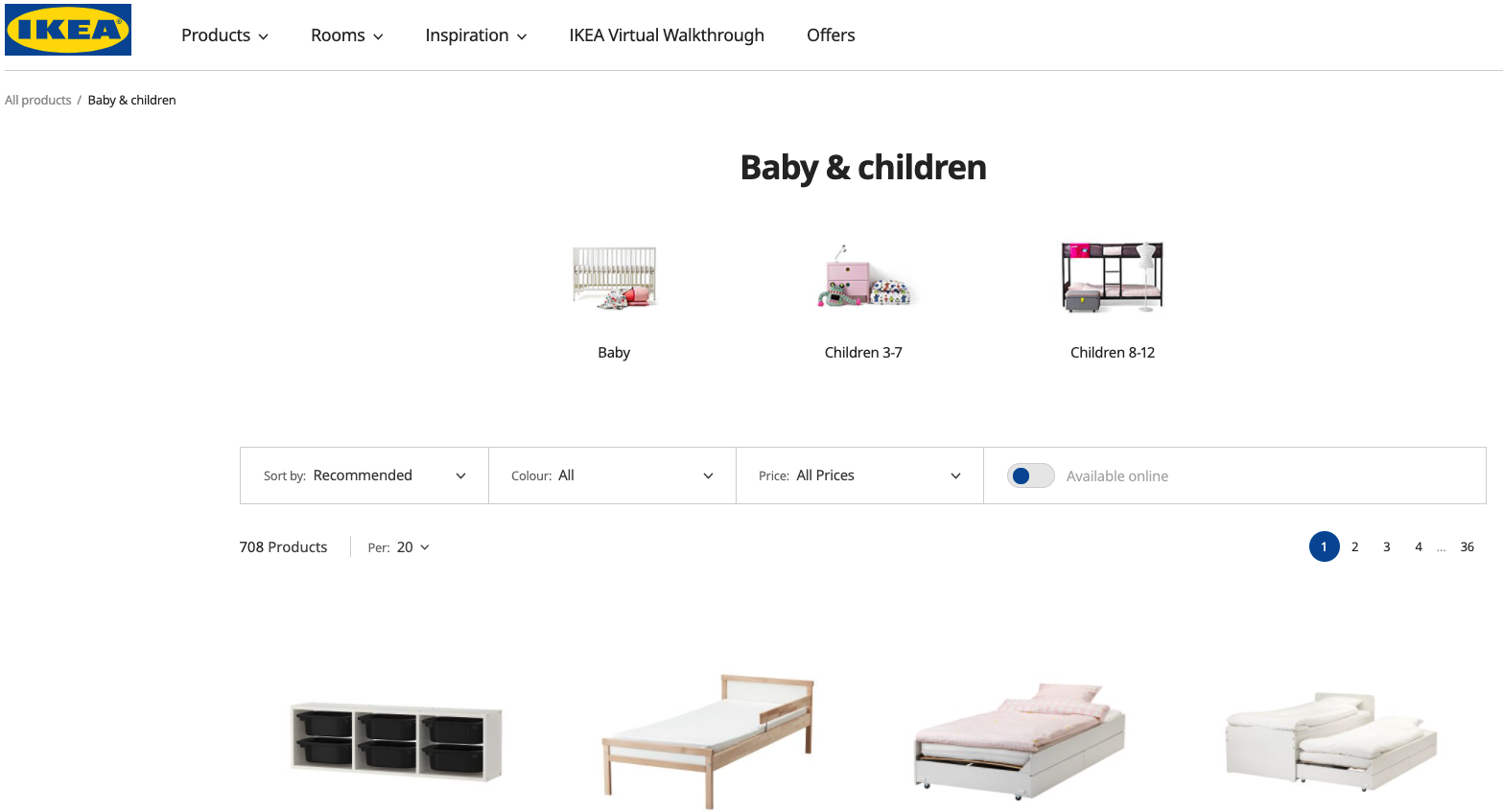
3. Category pages
This is where your available products are listed, usually in a grid pattern, so that a user can see as many of them at once as possible.
Products are listed according to their respective categories, and as such there are going to be many category pages.
These pages are what is often considered the “e-shop proper” where prices, general description, and product photo are included. Often these pages include the option of filtering so that the user exclude items that don’t fit the parameters of what they are looking for. A “quick-buy” button may also exist for each item listed.
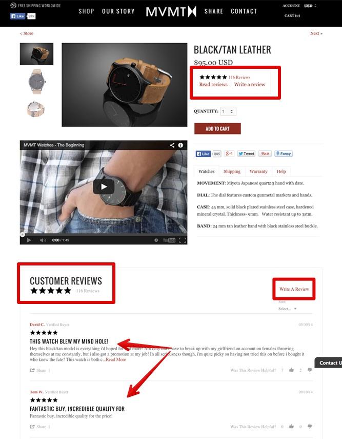
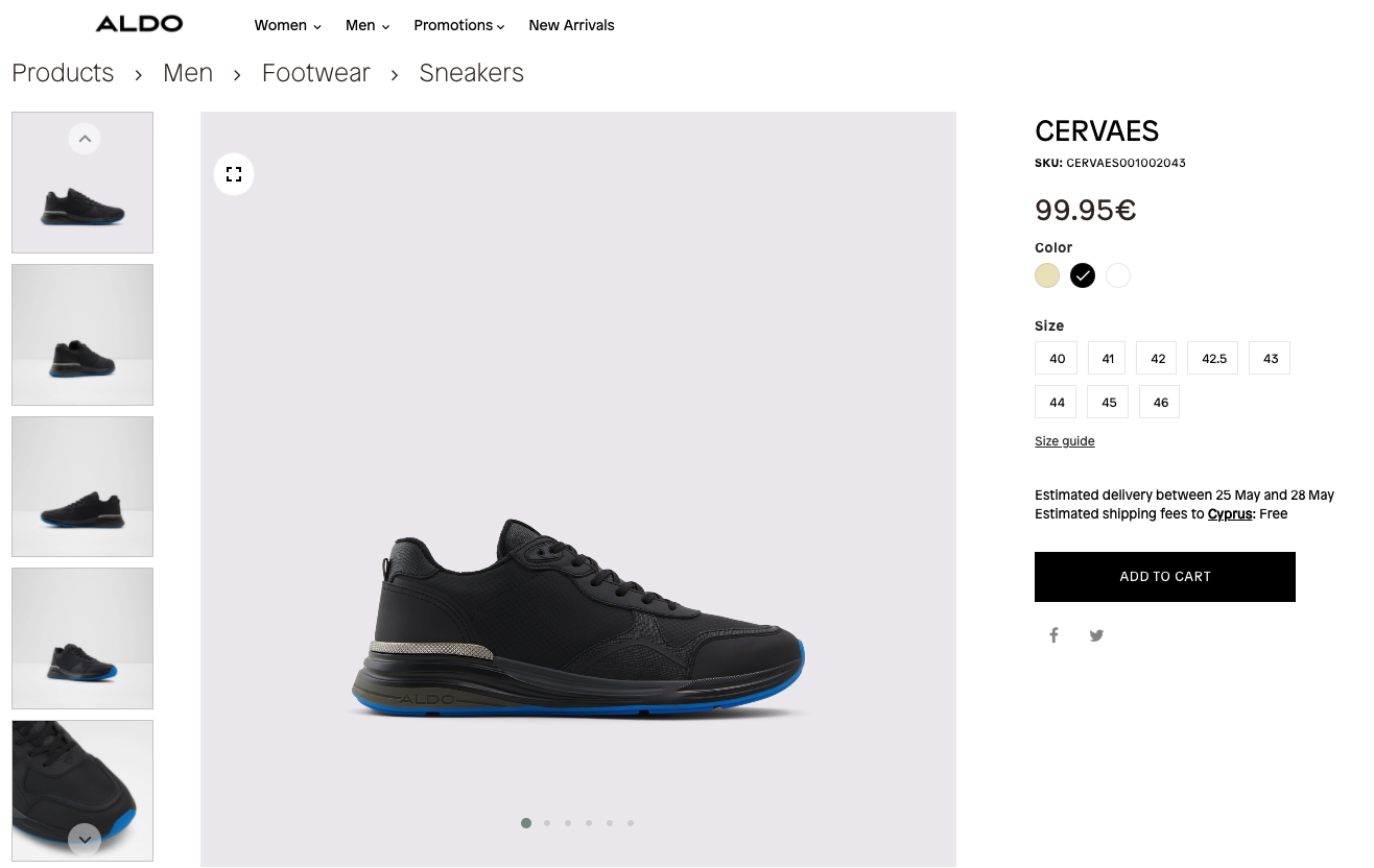
4. Product pages
These are pages dedicated to one product at a time. It is where all the product’s photos are listed, full descriptions and details, user reviews, pricing, and the “add to cart” button.
Consider these pages as the showcase for each of your products, and where all the frequently asked questions about the product may be answered.
5. Search Function
Giving consumers the ability to search for a product is an essential element of every eCommerce site’s functionality.
A search field should be located at a clear spot in the site design. It is usually on the navigation menu. Search results can be displayed as category pages, drop-down menu entries, or in other designs that fit with the site’s concept.

6. User account
Giving users the opportunity to store information about their purchases on your site, create wish lists, see past orders, and have addresses and other necessary data pre-filled in will help boost your sales as well as client loyalty.
Creating an account and logging in should be very easy and accessible to do on multiple occasions while the user is on the site. Often, a drop-down menu or small space in the site design for logging in is enough.

7. Add to cart
A necessary functionality that your eCommerce site must have is a visual confirmation that an item has been added to the user’s cart when they click the “add to cart” button.
How this is done can vary, but it’s good practice to give an overview of what has been purchased, as well as how close to free shipping a consumer is which can get them to keep buying. Another feature could be including item suggestions in the typical “guests who bought this item also bought…”
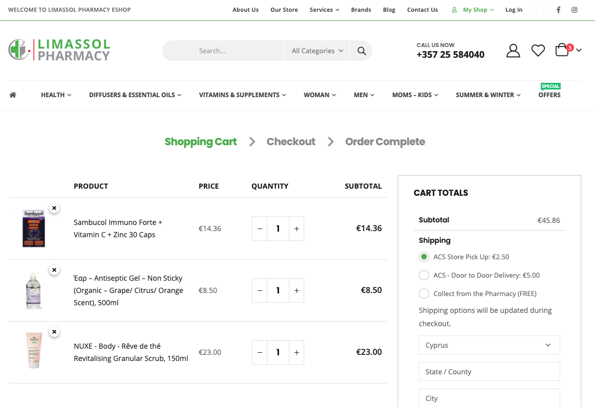
The cart page is where all the items the user has already added are listed. Useful functionalities include having a calculated sum of all purchases, a field for estimating shipping (if it isn’t free), a field for adding any coupons or promo codes, and a capacity to make changes to the list as the user needs them.
Make sure that the cart page informs the user of the end cost as much as possible, so no abandonments are made at the last moment which might imply frustration on the part of the client.
8. Stock availability
It’s important to let users know which items are in stock, which ones are running out, and which ones have sold out/ are out of stock. First off, it’s a good way to convince a user to make a purchase if there are few items left in stock and second off, frustration is avoided later when a purchase is cancelled due to item unavailability.

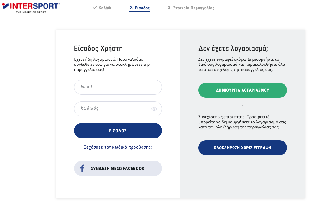
9. Checkout pages: Login or Guest checkout
Give users the option of going through checkout as a guest if they don’t want to create an account or logging in/creating their account on the spot if they do.
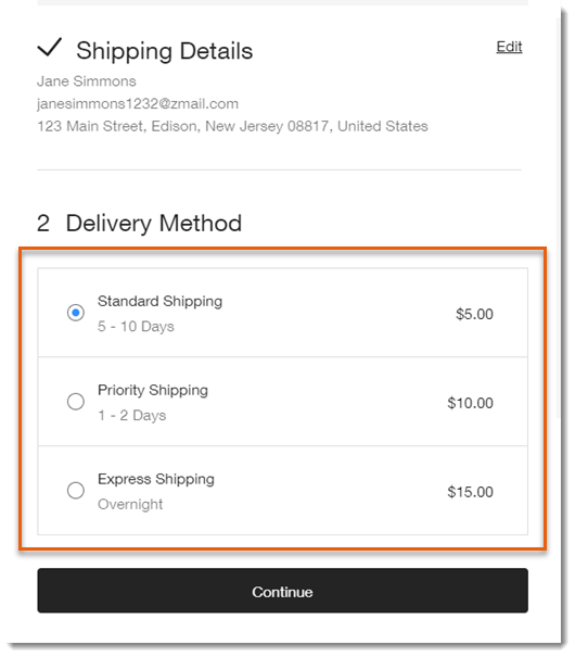
10. Checkout pages: Shipping
This is where the user will be filling in their shipping address information. It’s good to include a box to check if they want the billing address to be the same as the shipping one.
Another good practice, if such is available, is to give the user the option of choosing the type of shipping they want.
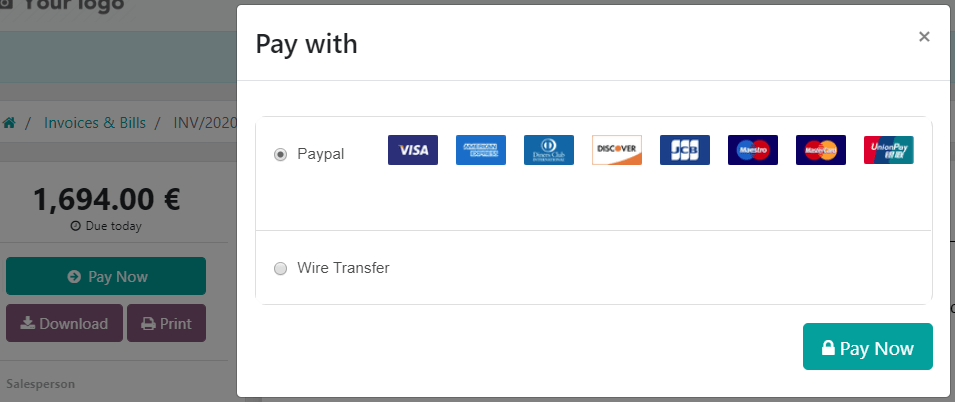
11. Checkout pages: Payment
This is where billing address information is entered by the user. Additional fields for promo codes and other discount elements such as gift cards or promo codes should be in a prominent spot.
Type of payment should also be available on this page, including the necessary fields for payment information to be entered, such as credit card information or PayPal.
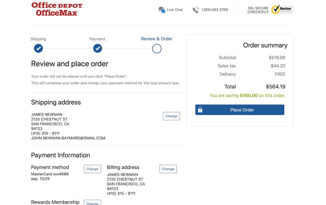
12. Checkout pages: Review
A review page where the items being bought, the shipping and billing address, assorted discount codes, shipping method and payment information is easily seen should exist to give the user the opportunity to double-check that they have entered all information correctly.
A clear message that this is a review page and they will need to confirm their purchase on the next page must be prominent.
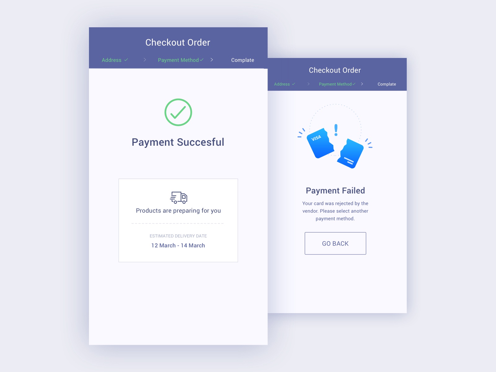
13. Checkout pages: Confirmation
This is the page where a thank you message appears along with confirmation that the purchase went through properly. If it didn’t go through properly (e.g. credit card information was denied) then the page will display an error message with the information of what went wrong instead.
If everything has gone well, this is the page to have a parting message, such as a reward for completing the purchase, or a prompt for further interaction (e.g. setting up an account).
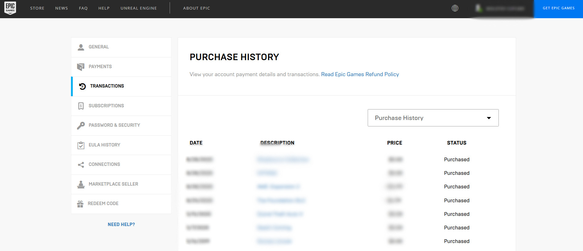
14. Account pages: Order history
In the user’s account, there should be a page where all the past orders are listed. This can be in the form of a simple list or a grid of products like the category pages, for the user to reference and perhaps repurchase.
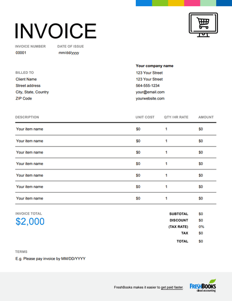
15. Account pages: Order invoice/receipt
There should be a page where all previous orders’ receipts and invoices, including information about shipping, are listed. An option for a print-friendly page can add to the page’s functionality.
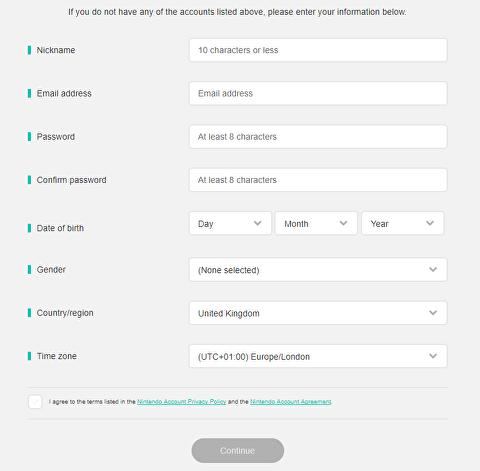
16. Account pages: Settings/ profile
This is the page where the user enters all personal information, including all relevant information. The option to delete any or all of the information must always be present.
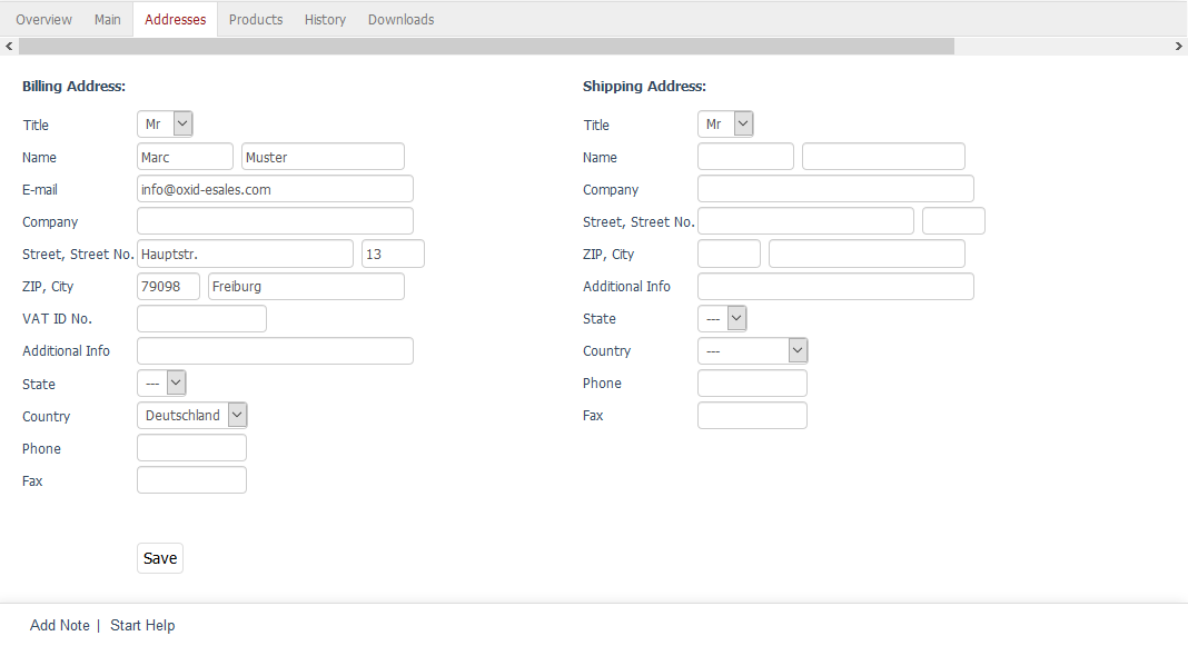
17. Account pages: Addresses
On this page, all the addresses have to be listed: billing addresses and shipping addresses, with the capacity for the user to edit them or delete them.
18. Email signup function
It is essential to keep growing your mailing list, and a perfect way to do it is to have an email sign up function. This can have a dedicated page where the user can enter their email address, or it can be a pop-up or other field to fill in somewhere prominently on the site.
To entice people to enter their address, some kind of reward or reasoning should be given. When a user signs up, a confirmation page should follow.

19. Return policy
A tremendously important part of the eCommerce site is the page where the return policy is clearly stated. This is where all the conditions that must be met will be listed.
It is in the brand’s interest to have very clearly described rules and conditions for returns. The page should be clearly linked to, usually at the footer of the site. The clearer the return policy the more confident the user will be to complete the purchase.

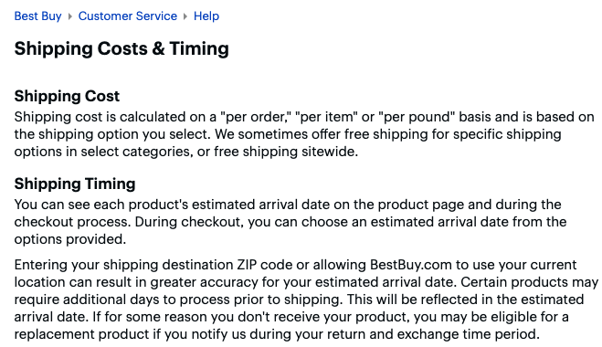
20. Shipping
All the information about the shipping options, the shipping costs, shipping time and when shipping will be free has to be clearly listed on this page.
21. Contact us page
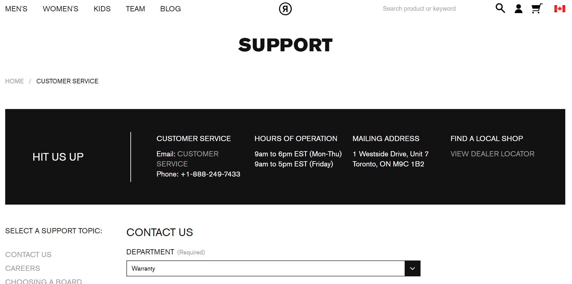
This is the page where users can contact your business to communicate. The page usually includes a contact form, a stated email address, some phone numbers, and possibly social media links.
Often there’s a “Help” section in the “contact us” page to answer FAQ’s and avoid having a big bulk of messages with similar content.
22. Store address/outlet addresses
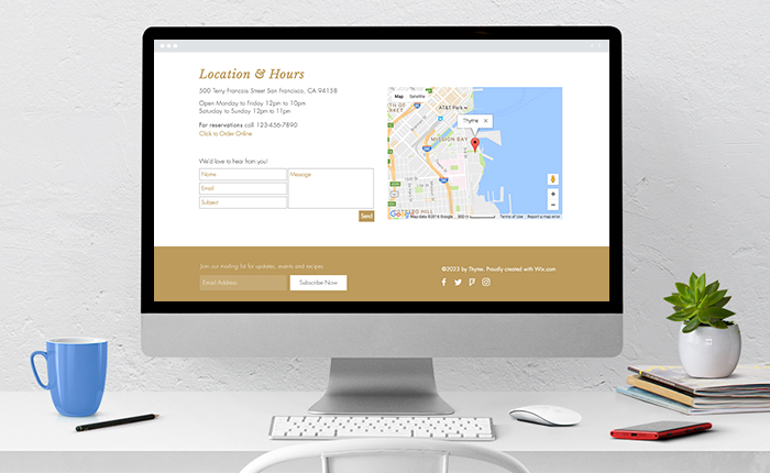
If the business has a brick-and-mortar branch, this page is where the address for the store should be. Often users might prefer to go to the store to buy, or at least to pick up their purchase and save on shipping.
Either on its own dedicated page or together with the addresses, if the page is easy to read through, provide details about the store such as opening and closing times, parking capacities, or a map to it.
If there is no store, but there are outlets or other stores carrying the brand’s products, a thorough list of where users can find and buy the products should be provided.
23. Terms of Service and Privacy Policy
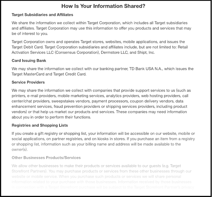
This is a page containing a legal document where the terms of service and usage of the site are delineated. There are automatic generators for these texts, but it’s best to have it done by a professional lawyer specializing in eCommerce pages’ TOS.
Furthermore, every eCommerce website is legally required to state how user data is collected and handled by the site. There are specific requirements for the site to be able to operate in certain regions, such as the EU (GDPR), Canada (PIPEDA) or the USA (CalOPPA).
Again there are generators for these, but it’s best that a legal professional compose it specifically for a particular eCommerce site.
24. Blog
Keeping a blog is a great way for customers to keep returning to the eCommerce site. This can include announcements and news, offers and promotions, but also commentary and useful information relevant to the brand’s general field.
Sharing know-how and other information freely add to a brand’s reliability and social responsibility profile.

25. Sitemap
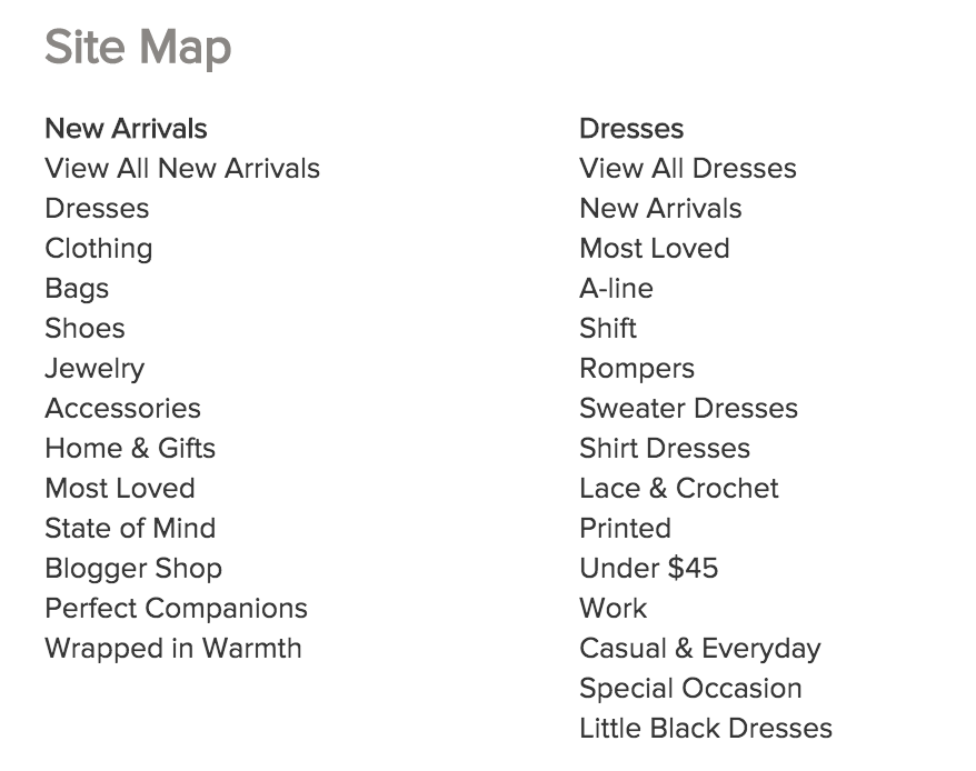
This is a simple page where all the eCommerce site’s pages are listed. The sitemap is mostly to help your SEO and help Google efficiently crawl the site, which helps boost its discoverability, but also help visitors find any page they might be looking for.
26. Feedback
Reviews shall be found in every product page, where users can give accounts of their experience with the product (it’s best if they can prove they bought it first before they can use the functionality), or at a dedicated page where users get to rate their overall experience at the site.
